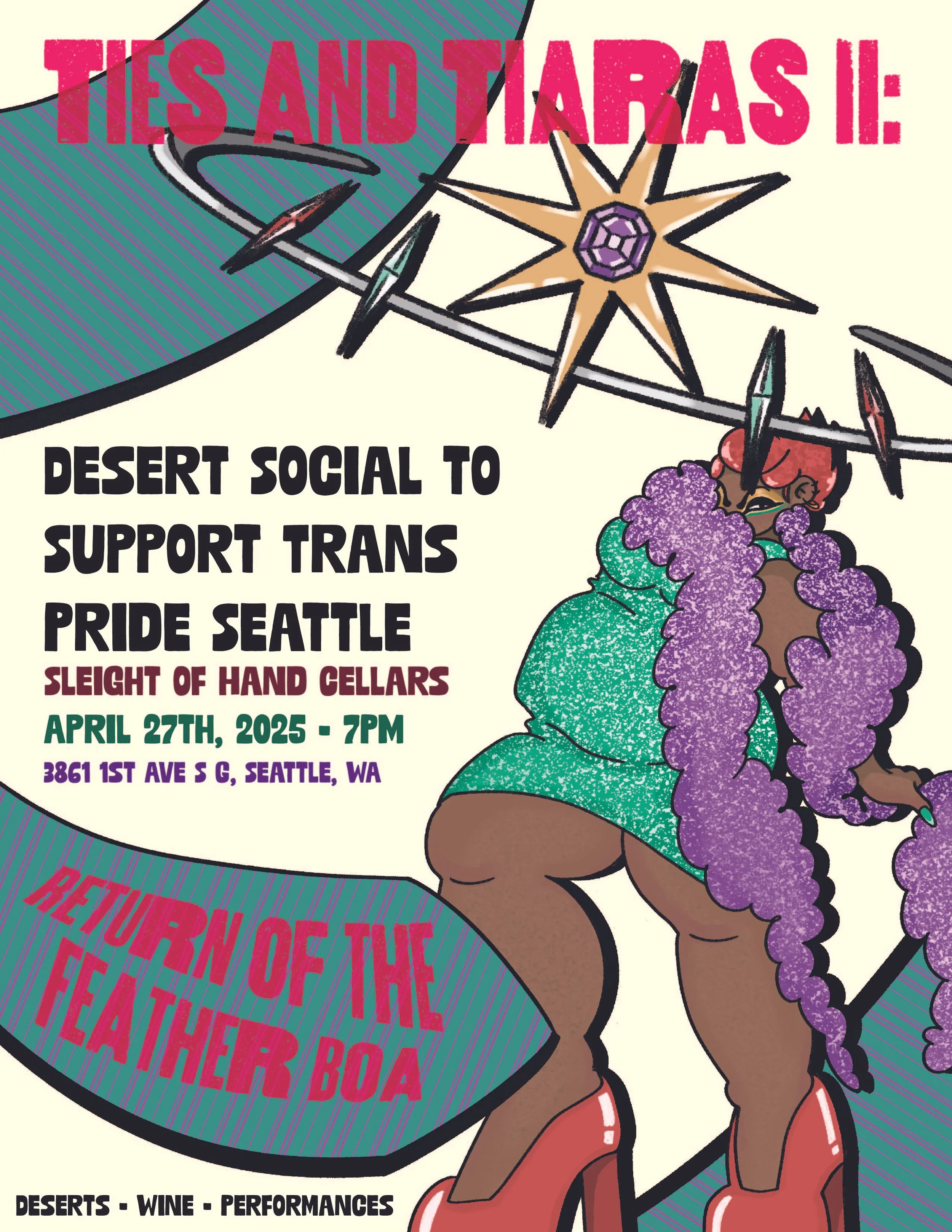
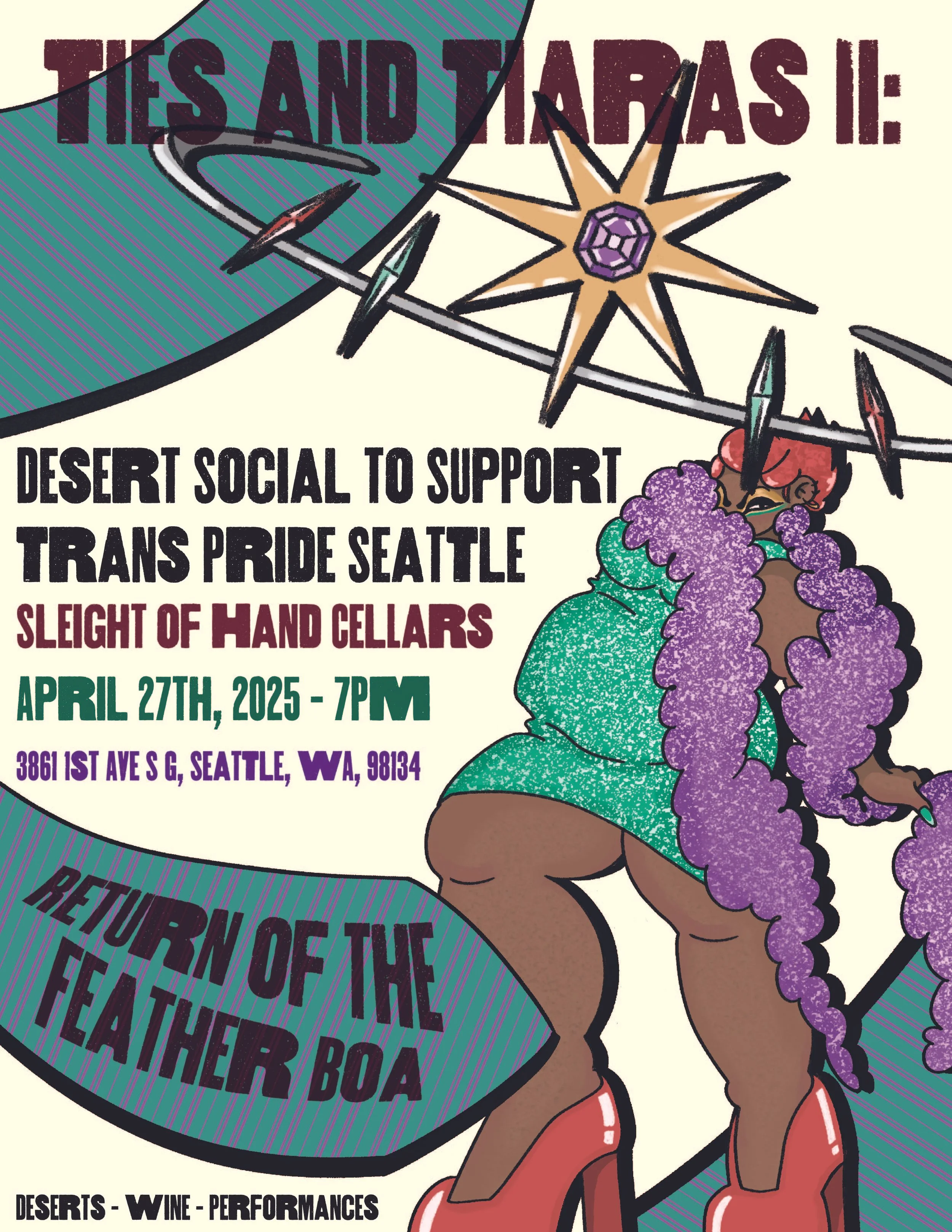
This flyer was an exploration into composition, typography, and the art of combining all of the elements together. For the task I was given information on the event and a brief guideline of the visuals needed. From those I created the figure and started to build up around her. After playing with different typefaces, compositions, colors, and arrangements, I ultimately landed on the version seen second from the top. Feedback from my creative team on legibility, contrast, and negative space took the composition a step further, improving upon the second image and finalizing into the version at the top!
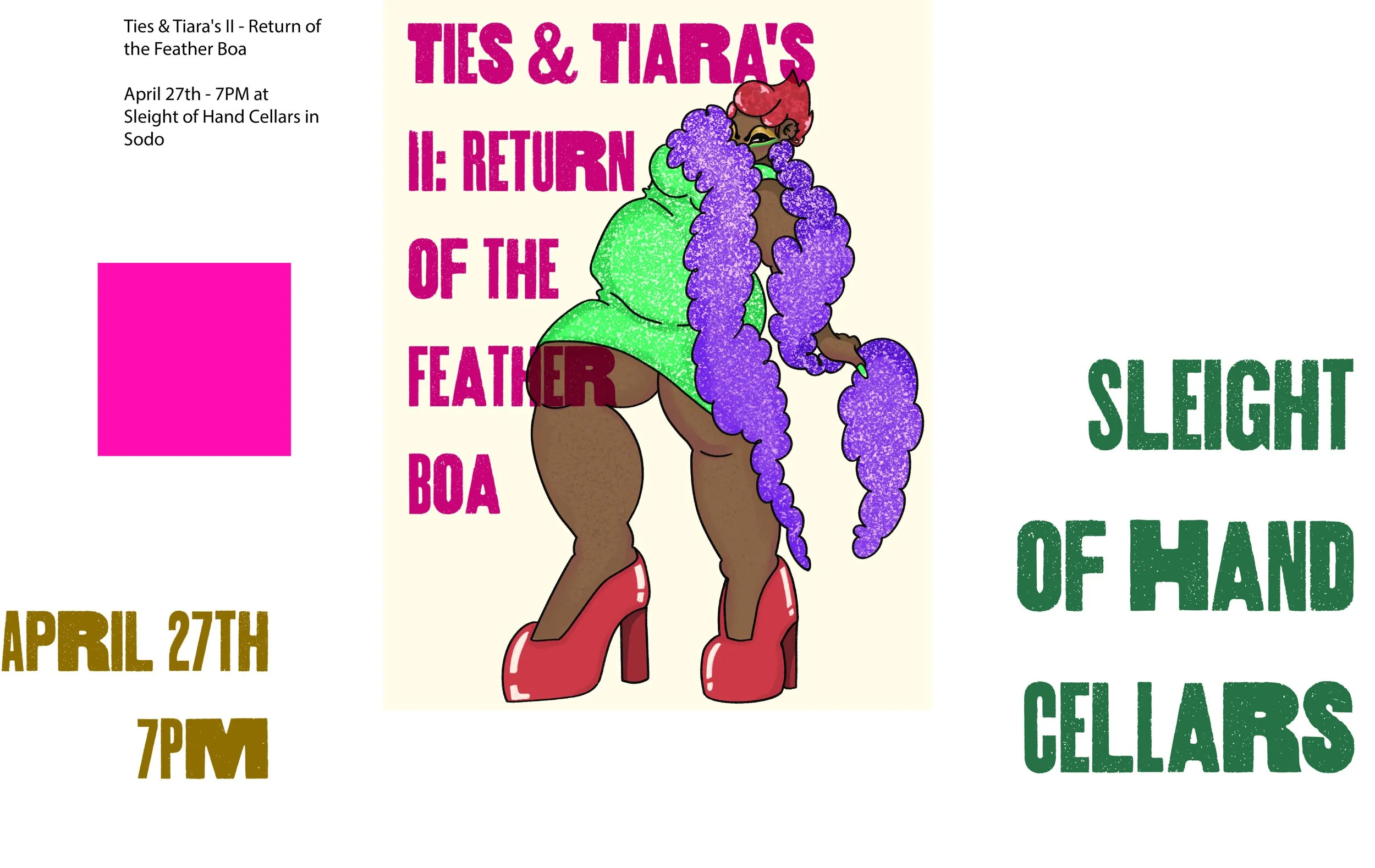
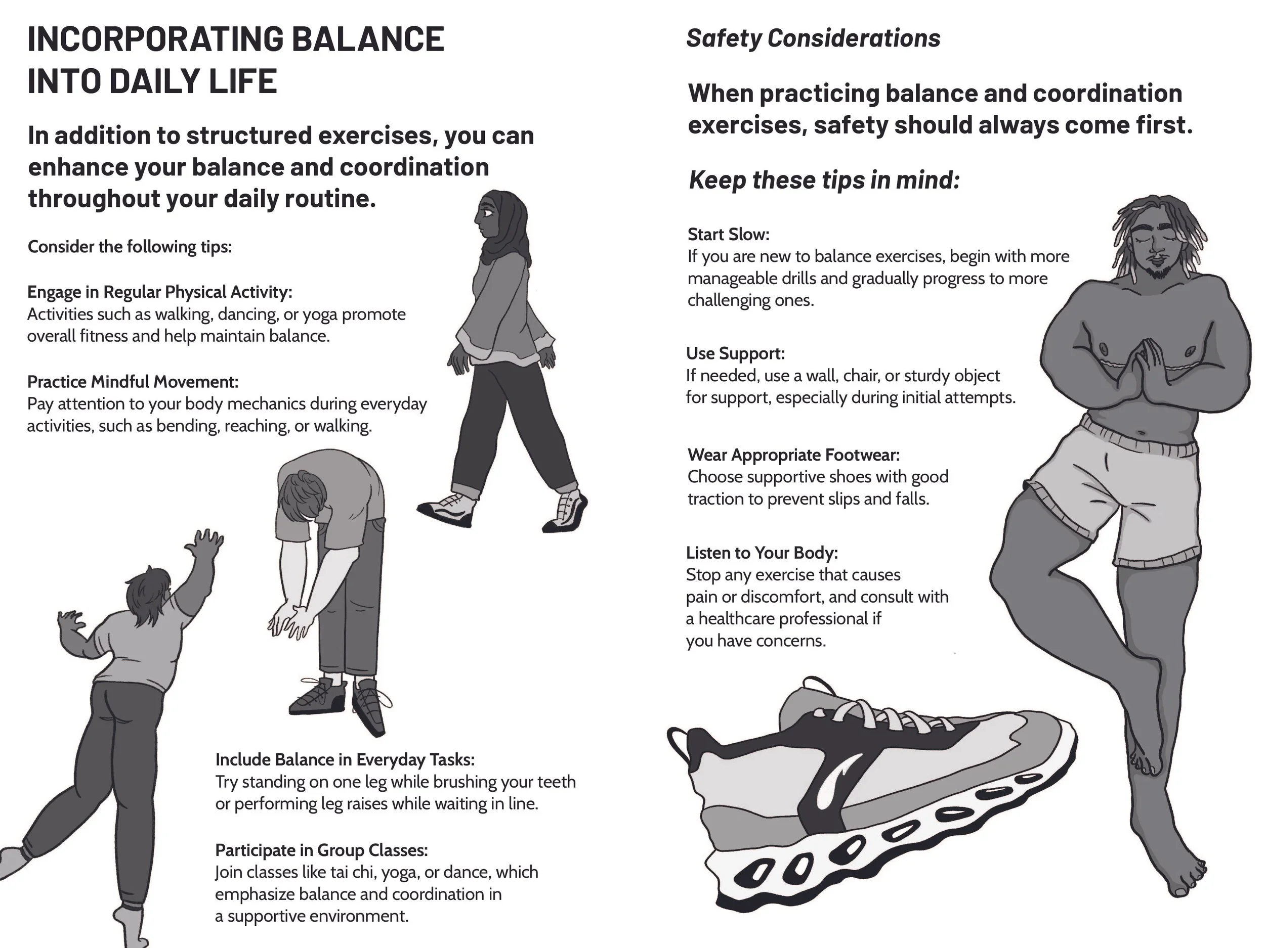
As an intern for Positive Masculinity Now, I have the responsibility of creating and formatting content into graphics that will be published in a self-care guide the company is set to release. Part of that responsibility means creating a formatting standard that will assist in the printing process. The graphics shown here include their trim lines and all follow a specific grid system to fit the dimensions given. With these guides in place, I can then create compositions, illustrating visuals and type-setting content.